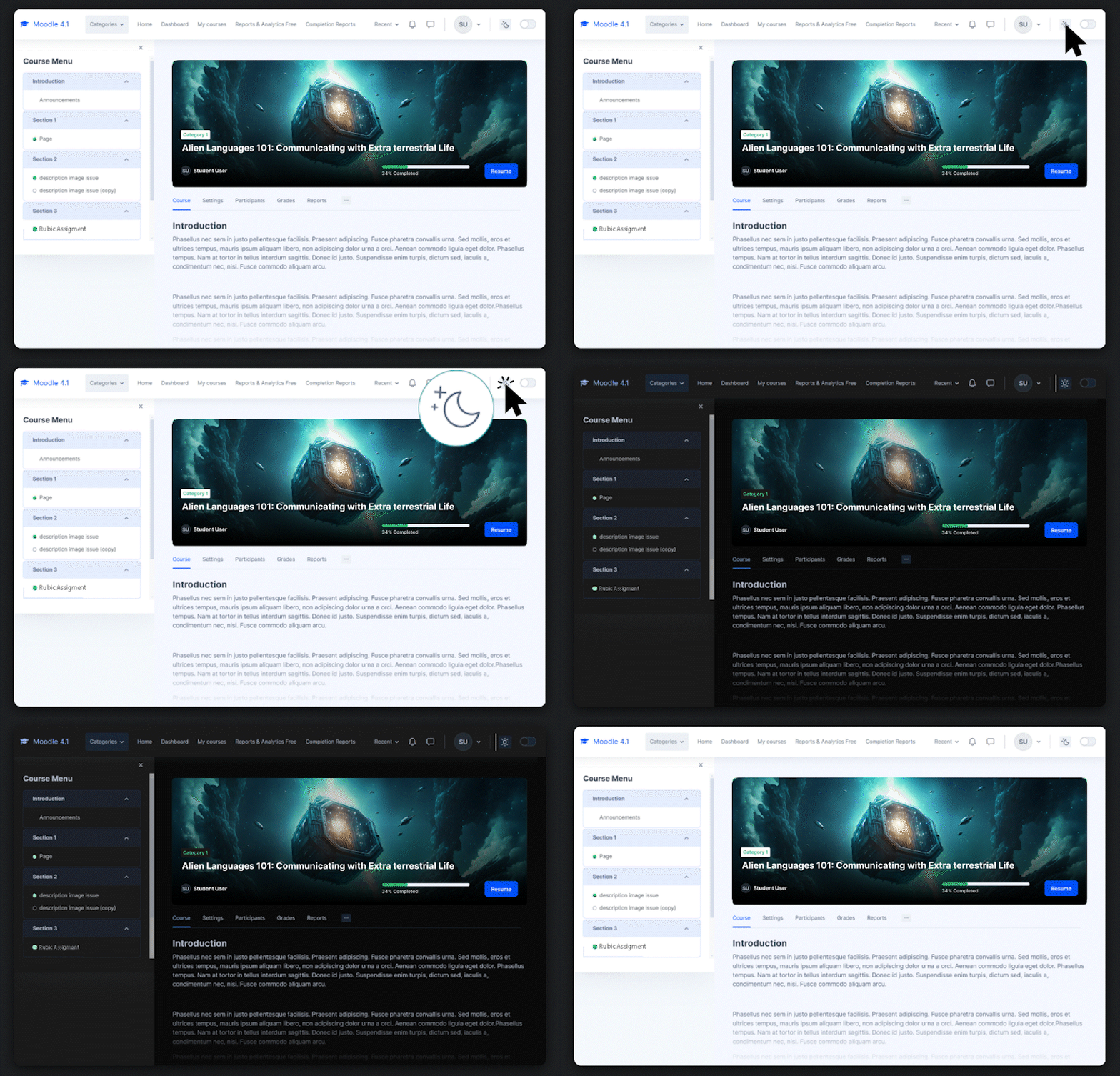
If there’s one User Interface (UI) trend that has really taken off during the last few years, it’s dark mode. Nowadays, not only websites but even apps and software come with this user experience (UX) built into them. However, in spite of its increasing prominence, the feature has long been missing from the Moodle™ platform for some unknown reason.
This is a bit ironic because the dark mode is even more important for eLearning sites than it is for any other kind of website, largely because of the time that users spend on them.
That’s why in this article, we’ll explore why dark mode is better for boosting your Moodle™ business. We’ll also introduce you to an easy way of adding the feature to your site.
Three Major Dark Mode Benefits for Moodle™ Site Owners
While there are several benefits of adding a dark mode UI to an eLearning site, here we’ll focus on the business side of it. We’ll take a look at three major dark mode benefits that you can derive instantly by adding it to your Moodle site. Here they are:
1. Increased average user time
The first major dark mode benefit for your Moodle site is that it can increase the average user time on your site. While the time that a learner spends on any eLearning site is largely determined by the quality of its courses, there are other reasons also that keep users from spending longer periods of time to complete their courses. Two of them include:
-
Screen glare that strains the eyes
-
The battery life of their devices
A dark mode UX helps users with both of these limitations. Not only does it significantly reduce screen glare, but it also consumes less power as fewer pixels need to be brightened up. That can allow your learners to complete their lessons and courses faster by spending more time on the site. And since average user time is a crucial factor influencing dwell time, it can be especially beneficial for your SEO.
2. New choice for user interface
Many users prefer a dark UI over the default light UI that we see on most sites. Some of them like it so much that they make it the default interface on their phones and computers. Such users may feel a bit disappointed when presented with the default light UI on your eLearning site.
By providing them with the option to switch to their preferred interface the Moodle dark mode can allow you to enhance their user experience and make it in line with their expectations. This can give them one more reason to buy your courses rather than the ones offered by your competitors.
3. Accessibility for vision-impaired audience
Finally, the Moodle dark mode can also make your site friendly and accessible for people with vision impairments and disabilities. Many vision-processing disorders impact people’s ability to process bright colors, including white.
The dark mode UX can be really helpful for them. It can help their eyes process your course content more easily depending on which color among black and white they can see more easily. If they have difficulty processing white, they can keep the default light skin, which shows the text in black. If they have difficulty processing black, on the other hand, they can switch to dark mode to see the text in white.
Wrapping up
Dark mode can play a major role in improving the UX of your Moodle site in many ways, ultimately making it more user-friendly. And when your site is more user-friendly, it not only enjoys greater trust among your existing users but also attracts more users through word of mouth and higher search rankings. Therefore, it’s one of the most crucial features that you can add to your site. Fortunately, it’s not difficult to add this feature to your Moodle site anymore. Sites using Edwiser RemUI can do it easily as dark mode UX is now a part of our theme. Just install or update RemUI to the latest version and your users can start using it right away.


