“The first time Moodle™ looks difficult to use. The graphical user interface is also not that attractive” – Aparna M
“Moodle™ interface is outdated, there are better learning platforms that offer a friendly user experience e.g. Google classrooms” – Amal A
“The interface seems to be from the 90s” – Abir
“Overall the interface could be simpler to navigate” – Jake Tully
These are some of the many issues the Moodle™ community is talking about and grappling with constantly!
One of the long-standing problems with Moodle is the issue of its general appearance.
So, needless to say, that making Moodle look beautiful is hard work. Firstly everyone uses it differently for different e-learning needs. It also means that the end results always scale differently and the opinions differ from one moodler to another.
But at the end of the day, the biggest challenge is to build a cleaner Moodle site with a visually pleasing interface and simple navigation.
So, how to make moodle more attractive to your students?
Let’s answer this big question today.
Making Moodle™ Look Good (Without affecting performance)
Now as mentioned before, it does take a bit of effort to improve the look of your Moodle site. Simply because there are many aspects to consider!
This article aims to explore some of them. And give you a holistic idea about how you can add that MUCH-NEEDED oomph to your Moodle site!
#1 Creating an Engaging Homepage or Pre-login Experience
Starting with the homepage as this is the gateway for your learners to the rest of the pages of your Moodle site.
The Front Page FAQ offers a couple of suggestions on how to improve the homepage.
To take your homepage customization a few notches higher when it comes to ease and flexibility, you could use Edwiser RemUI’s homepage builder to create really unique homepage designs. It’s pretty systematic too! You can easily modify your homepage fold by fold.
Pro Tip:
It’s best to keep your homepage simpler, with neat sections divided into multiple uniform folds.
Also, ensure that you provide a simple way for your learners to log in. For the students who are not logged in, you could highlight interesting bits of information about the courses you’re offering.
Now, some moodlers might say “Oh, great! My homepage looks good enough, works amazing and so does my Moodle”.
Your homepage definitely looks impressive. But I’m not sure about how your Moodle looks throughout! The reason being, as we researched and scrolled through the forums, we stumbled upon this concern:
“Mainly it’s the front page that gets improved and the insides of Moodle look pretty much the same”
And that brings us to the next point:
#2 Improving Post Login Experience
Once your students are logged in, they expect the same continuity in the next set of pages they interact with. This is a personalized space and it’ll change based on different user roles.
In Moodle, there is a common setting using which the admin can decide the landing page to be displayed post login. It could be the dashboard page or the Homepage of your Moodle site.
Dashboard page is something that is available inside Moodle by default. However, if you have the Edwiser RemUI Pro theme, you can get access to multipurpose dashboard blocks to create an exclusive custom dashboard.
#3 Modifying Colours and Fonts
A well-designed Moodle with effectively used colours can help you take branding to the next level. Apart from branding, it also helps in building a sense of trust. Because colours along with logos are critical to building the brand’s image.
Think of it as a push to familiarise your learners with your courses.
The consistency in colours, font and styling is responsible for a unifying user experience. This further can be instrumental in encouraging your students to explore your Moodle site or at least stay put longer.
Why?? Because the colours on your Moodle site set the tone.
For example, elementary school students prefer bright colours like yellow and red; whereas university students prefer blue. Yellow encourages creativity, while blue helps build concentration.
Also, experimenting with different types of font can be beneficial in establishing your e-Learning brand. Research tells that the Sans-serif font is widely used on Moodle platforms as it’s screen-friendly and easier to read.
If you plan to use a theme for Moodle, your colour customization for branding is sorted. Because the theme’s exhaustive colour palette can be used to set appropriate colour schemes to your Moodle site for better brand recognition.
#4 Using Better Course Formats
Now, make sure your designing efforts add up. If your Moodle site looks good on the outside, it manages to set a good impression. But it can be a huge turn-off if your site is struggling to appear good on the inside.
For instance, your course presentation or course structure matters a lot in this case. Once logged in, your students should be able to navigate the courses without any confusion. It should be really easy for them to visualize their courses and also interact with them.
That’s when Course Formats help. There are several formats available in Moodle. Some of the popular ones are Grid Format, Edwiser Course Formats, Collapsed Topics, Tiles Format etc.
Course formats not only help present your courses better, but they also improve student engagement and experience. Opting for the ideal course format based on your course delivery or e-Learning needs becomes crucial at this stage.
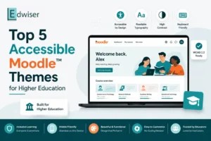
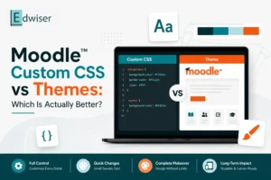
#5 Using the Right Theme
Last but certainly not least! Given the interface is not very user-friendly, Moodle needs reskinning!
That’s when having a good theme makes all the difference. Because themes provide the look & feel, functionality, and flexibility in design they promise in one single package.
A theme can save you hours of customization time and the frustration of having to deal with code or the hunt to find the right set of plugins. Moodle has 1600+ plugins! I’m sure that’s a huge number of plugins to work with. And it especially isn’t easy for beginners!
But picking the right theme can be tricky. Because there are many free+ paid themes out there to do the job. So, before you choose your go-to theme, make sure you’ve understood your e-Learning needs.
More specifically, you should have an idea of how you want your Moodle to look like! Hopefully, that’ll put things in perspective. Here’s a quick checklist of features to help you pick the right theme based on your requirements.
Conclusion
So, that’s a wrap on how you can go about creating a Moodle site that looks good and performs great!
On a side note, having a full-fledged theme really helps. It’s way better than tinkering with complex settings every now and then.
So, after a point, using a dedicated theme for Moodle like Edwiser RemUI could make sense because:
- It has the homepage builder to build your custom/modern homepage,
- It’s equipped with multiple layouts to choose from for the course archive page
- It provides a custom login page as well as a custom profile page,
- It also offers multiple layouts for the Course enrollment page that help you give a user-friendly and modern design to the course enrollment page
- And on top of this, our theme design will be uniformly seen across all standard pages of Moodle for a consistent user experience
To make things easier for you. And to get you started without any advanced Moodle skills here’s a detailed guide to building a super-engaging K-12 Moodle site using Edwiser RemUI
Hope you like what you read. In case you have any suggestions or feedback, drop us a line in the comments section below. Else you could even email us at edwiser@wisdmlabs.com
Happy Moodling!!!
.