Moodle Accessibility isn’t just a feature—it’s a commitment to empowering every learner, ensuring that digital education is open, inclusive, and barrier-free for all.
Have you ever tried navigating a website with your eyes closed? Or attempted to use a mouse with your non-dominant hand? These simple exercises reveal just a glimpse of what millions of learners face every day when interacting with digital education platforms.
Here’s a sobering reality check: over 1.3 billion people worldwide – roughly 16% of our global population – experience significant disabilities. That’s one in seven people who might struggle with your Moodle course if it’s not designed with accessibility in mind. And guess what? Your theme choice plays a pivotal role in determining whether your learning environment welcomes everyone or inadvertently creates barriers.
Source: https://www.who.int/publications/i/item/9789240063600
“But my students don’t have disabilities,” you might think. Let’s challenge that assumption. From the student with temporary wrist pain who can’t use a mouse, to the learner with undiagnosed dyslexia struggling to read certain fonts, to the busy professional accessing courses on a tiny smartphone screen – accessibility features benefit everyone, not just those with permanent disabilities.
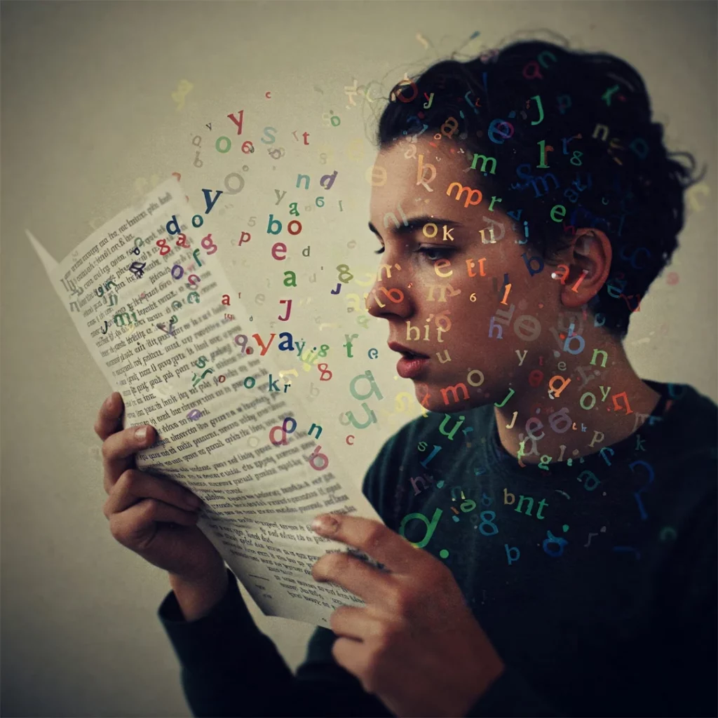
Your Moodle theme isn’t just about aesthetics; it’s the foundation of your learning environment’s inclusivity. A visually stunning theme that fails accessibility standards is like building a beautiful campus without ramps or elevators – it sends a clear message about who you think belongs in your learning community.
Throughout this article, I’ll explore how theme selection impacts inclusive learning, unpack essential accessibility features every Moodle theme should have, and showcase how Edwiser RemUI is leading the accessibility revolution with features that go beyond basic compliance to create truly inclusive learning experiences.
Whether you’re a Moodle administrator, course creator, or educator, join me as we dive into the world of accessible e-learning. Because when we design for accessibility, we create better experiences for everyone.
The Importance of Accessibility in Moodle
Imagine trying to complete a timed quiz while your internet cuts out every few minutes. Frustrating, right? Now multiply that frustration tenfold – that’s what inaccessible e-learning feels like for many students. In the Moodle ecosystem, accessibility isn’t just a technical checkbox; it’s about creating learning spaces where every student can thrive regardless of their abilities or circumstances.
Accessibility in Moodle e-learning means designing digital environments that everyone can perceive, understand, navigate, and interact with. It’s about knocking down the digital barriers that might prevent a student with vision impairment from reading your content or stop someone with motor difficulties from navigating your course.
WCAG: The Gold Standard in Digital Accessibility
“What gets measured gets managed,” as the saying goes, and WCAG (Web Content Accessibility Guidelines) provides the yardstick for measuring digital accessibility. Created by the World Wide Web Consortium (W3C), these guidelines aren’t just arbitrary rules – they’re the culmination of decades of research on how to make the web work for everyone.
WCAG breaks down accessibility into four fundamental principles:
👉 Perceivable: Can all users access the information through at least one sense? Your stunning video lecture needs captions for deaf students and audio descriptions for blind learners.
👉 Operable: Can everyone navigate and use your content? That drag-and-drop activity might be impossible for someone who can’t use a mouse.
👉 Understandable: Is your content clear and predictable? Complex jargon and inconsistent navigation can leave many learners stranded.
👉 Robust: Does your content work across platforms and assistive technologies? If your course breaks when accessed by a screen reader, you’ve excluded an entire group of students.
Accessibility in Moodle Lifts All Boats
Here’s the plot twist: accessibility features don’t just help students with disabilities – they make learning better for everyone. This concept, known as the “curb-cut effect,” refers to how sidewalk ramps designed for wheelchair users also benefit parents with strollers, travelers with rolling luggage, and countless others.
The digital equivalents are everywhere in Moodle:
👉 Captions don’t just help deaf students – they benefit anyone watching videos in noisy environments or learning in their non-native language.
👉 Clear navigation and consistent design don’t just assist users with cognitive disabilities – they make your course easier for everyone to use, reducing cognitive load and frustration.
👉 Text that can be resized helps not only those with vision impairments but also anyone working on small screens or in poor lighting conditions.

Beyond the classroom, these skills prepare students for a world where digital accessibility knowledge is increasingly valuable. As future professionals, they’ll need to create accessible content themselves – whether they become teachers, web developers, or business leaders.
How Moodle Themes Impact Inclusive Learning
Your Moodle theme isn’t just a pretty face. Behind those colors and layouts lies complex code that directly determines who can access your content and who gets left in the digital dust.
When you select a theme, you’re actually choosing a complete HTML, CSS, and JavaScript framework that controls how content appears and behaves. These technical elements don’t just affect aesthetics; they determine whether a screen reader can interpret your page, whether a keyboard user can navigate your menus, and whether someone with low vision can distinguish text from background.
When Branding Battles Moodle Accessibility
School colors matter – I get it! That electric purple and neon yellow might perfectly capture your institution’s spirit, but they might also create a nightmare for students with vision impairments. Color contrast isn’t just a design preference; it’s a fundamental accessibility requirement.

WCAG guidelines recommend a contrast ratio of at least 4.5:1 for normal text and 3:1 for large text.
Getting Lost in the Learning Maze
Have you ever visited a website where you couldn’t figure out where to click next? Now imagine facing that confusion when your grade depends on it – and you can’t use a mouse. Many Moodle themes create navigational mazes that particularly impact students using keyboard navigation or screen readers.

The technical culprits:
👉 Drop-down menus that only appear on mouse hover
👉 Custom JavaScript navigations that ignore keyboard focus indicators
👉 Skip navigation links that are hidden from all users (they should be visually hidden but appear when focused)
👉 Inconsistent page structures that force screen reader users to relearn navigation patterns for each section
When Interactive Elements Become Obstacles
Moodle thrives on interaction – quizzes, assignments, forum posts – all requiring forms and interactive elements that students must navigate. Yet many themes fail to properly implement these crucial components.
Common problems:
👉 Form fields without proper labels (screen readers announce these as “blank” or “unlabeled”)
👉 Custom form elements that look unique but ignore accessibility requirements
👉 Error messages that rely solely on color to indicate problems (like red outlines without text)
👉 CAPTCHA implementations that lack audio alternatives
When Mobile Becomes Immobile
More than 60% of students access online learning materials via mobile devices at least part of the time. Yet countless Moodle themes collapse into unusable messes on smaller screens.
Common technical failures in responsive design:
👉 Text that becomes microscopic on mobile devices
👉 Interactive elements spaced too closely for touch navigation
👉 Important content that disappears entirely on smaller screens
👉 Horizontal scrolling that hides critical navigation or content
Key Moodle Accessibility Features Every Theme Should Have
Your Moodle theme is the foundation of your digital learning environment. Just like a well-designed physical classroom accommodates all students, your digital classroom needs specific features to welcome everyone. Let’s explore what makes a truly accessible Moodle theme tick – and why these elements matter more than you might think.
Consistent Navigation
Your Moodle theme should maintain the same navigation patterns throughout the site. This means placing menus in consistent locations, using recognizable icons, and making sure users always know where they are within the course structure.
Moodle Accessibility features great themes include:
👉 Breadcrumb trails showing clear page hierarchy
👉 Visible focus indicators that highlight the current interactive element
👉 Persistent navigation that doesn’t vanish as users move through content
👉 Clear visual cues that distinguish between different types of links
Keyboard Navigation
Not everyone uses a mouse. Some can’t, others prefer not to. Either way, your Moodle theme needs to fully support keyboard navigation and screen readers.
What does this look like in practice? Every interactive element – buttons, links, form fields, drop-down menus – must be accessible via keyboard alone. Users should be able to tab through content in a logical order and activate any control using only their keyboard.
Screen readers need proper semantic HTML to understand your content. This means using appropriate heading levels (H1, H2, H3) in logical order, proper list structures, and ARIA landmarks when needed.
Color Contrast
That vibrant red text on your blue background might look striking, but for colorblind students (about 8% of males), it might be completely unreadable. Color contrast isn’t a minor design detail – it’s a fundamental requirement.
Your Moodle theme should:
👉 Maintain at least 4.5:1 contrast ratio between text and background
👉 Never rely on color alone to convey information
👉 Provide high contrast mode options for users who need them
👉 Use patterns or shapes alongside color to differentiate elements
Assistive Technology Support
Behind the scenes, many students use tools you might never see – screen readers like JAWS or NVDA, magnification software, voice recognition programs, or specialized keyboards and switches. Your Moodle theme needs to work seamlessly with all these assistive technologies.
This requires:
👉 Proper semantic HTML structure throughout the theme
👉 ARIA attributes for complex interactive elements
👉 Focus management that doesn’t trap keyboard users
👉 Form labels that properly associate with their inputs
Edwiser RemUI’s Moodle Accessibility Features
When it comes to Moodle accessibility, Edwiser RemUI doesn’t just check boxes – it tears down walls. The team behind this innovative theme understands that true accessibility means creating learning environments where everyone can participate fully, regardless of their physical or cognitive abilities.
Beyond the Basics of Accessibility in Moodle
RemUI’s accessibility journey began with focusing on the most crucial student touchpoints. The theme offers complete keyboard navigation across essential Moodle pages – Login Page, Dashboard, Course Archive, and Course Page. This isn’t just convenient; it’s life-changing for students who can’t use traditional pointing devices.
The theme also incorporates text-to-voice functionality that transforms on-screen elements into spoken content. For visually impaired learners, this feature opens doors that might otherwise remain firmly shut. RemUI plays nicely with screen reading tools too, including the ChromeVox Classic Extension, ensuring that your course content reaches every student.
Customization for All
RemUI has recently supercharged its accessibility offerings with an innovative widget that puts customization power directly in students’ hands.
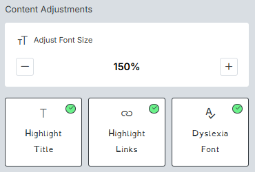
Content Adjustments:
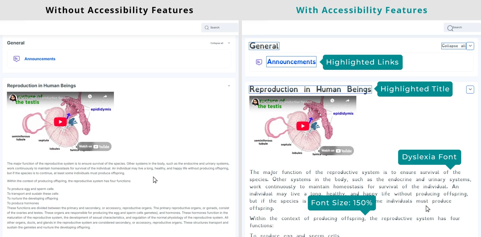
✅Need larger text? The Font Size adjuster lets students make content as large or small as needed without affecting layout integrity.
✅Struggling to find section headings? The Title Highlighting feature adds distinctive borders around headings, making course structure instantly visible.
✅Missing clickable elements? Link Highlighting makes interactive elements pop, preventing frustration and missed opportunities.
✅Wrestling with text readability? The Dyslexia Font option switches to a specialized typeface that many dyslexic readers find dramatically easier to process.
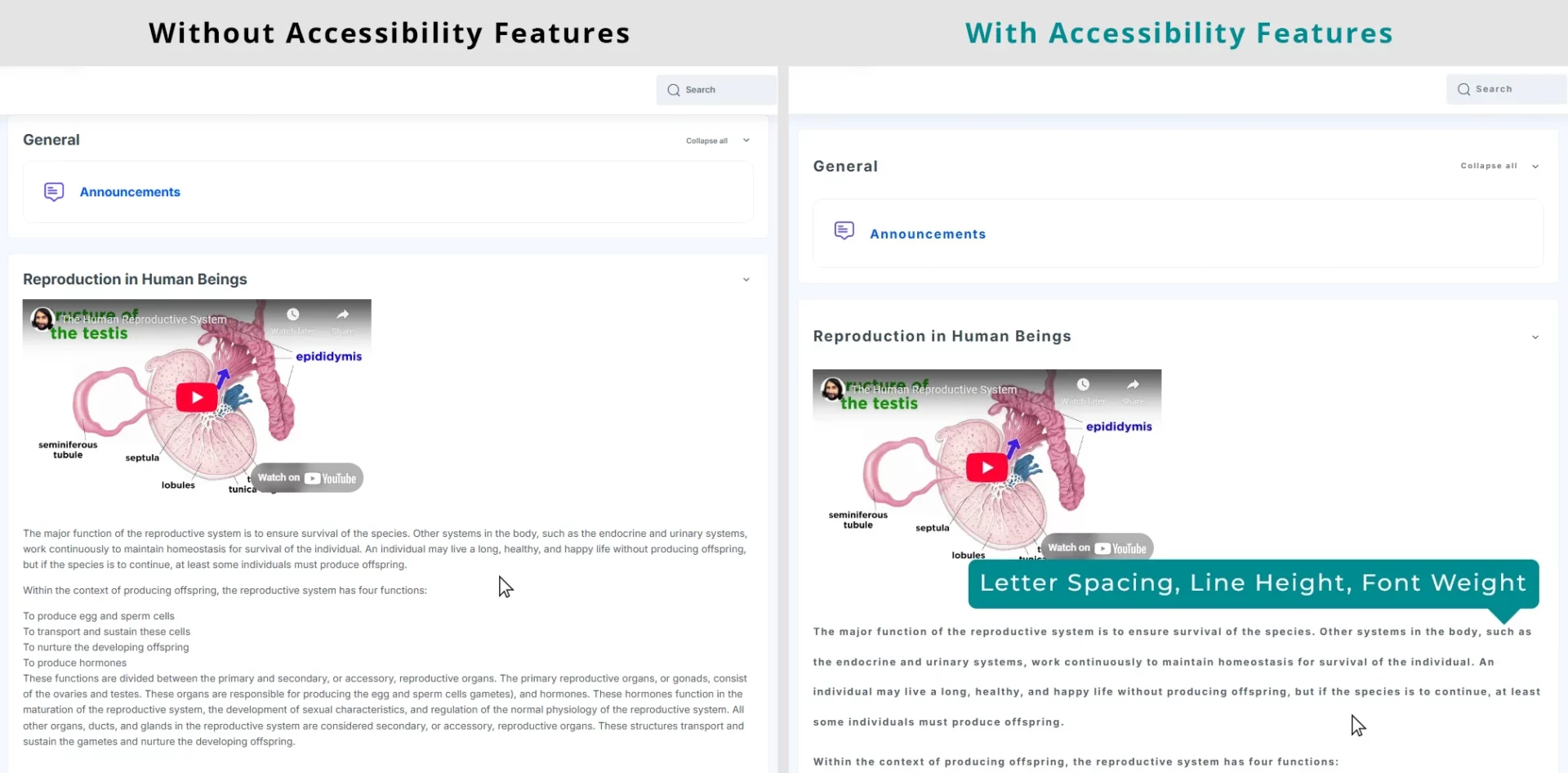
Beyond these basics, RemUI now offers finesse controls that would make any typography expert swoon:
✅Letter Spacing adjustments create breathing room between characters.
✅Line Height controls add vertical space between text lines, reducing the “crowded” feeling that can overwhelm some readers.
✅Font Weight options make text bolder and more distinct for those who find standard fonts too light.

Color Transformations:
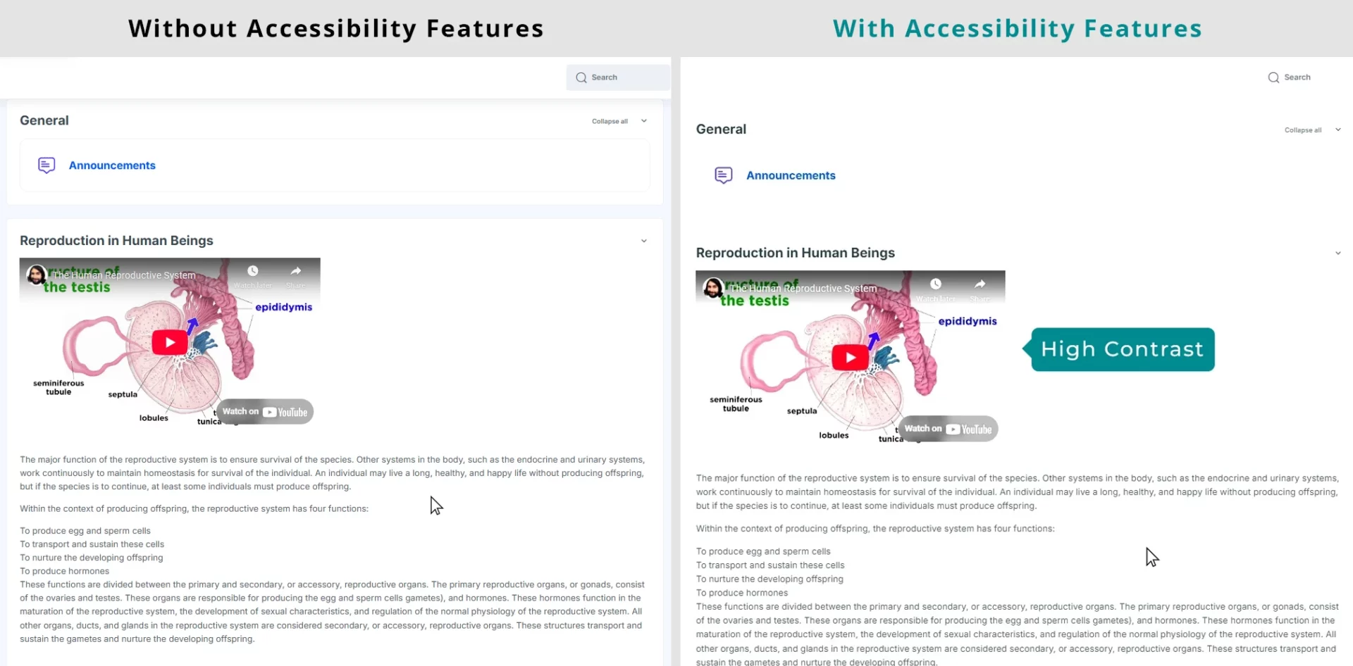
Color perception varies wildly among learners, and RemUI now accommodates this diversity beautifully. Students can choose from:
✅Dark Contrast mode for reduced eye strain during nighttime study sessions.
✅Light Contrast settings for daytime viewing comfort.
✅High Contrast options that make text stand out dramatically against backgrounds – crucial for many vision impairments.

For students with color processing differences, the theme offers:
✅High Saturation to make colors more vivid and distinct.
✅Low Saturation for those who find intense colors distracting.
✅Monochrome mode that eliminates color distractions entirely.


Specialized Tools:
The final category includes targeted solutions for specific accessibility challenges:
✅The Reading Guide creates a movable focus line that follows cursor movement – a game-changer for students who easily lose their place when reading.
✅Stop Animations freezes moving elements that might trigger sensory issues or simply distract from learning.
✅Big Cursor enlarges the pointer, making it easier to track and position accurately.


🧭🏷️Pre-BFCM Digital Treasure Hunt Get 25% OFF on all Edwiser Products Use Code: 124D198B90


